Offset was on fire! ››
Welcome to our new studio ››
Welcome aboard Julie ››
Keep your dealers engaged by design ››
Our Five a Day For Fendt ››
Branding ››
Thoughts ››
Inside ››
Outside ››
May 7th 2013
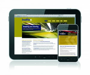
With the ever increasing amount of new devices and resolutions it is impossible for brands to adapt without creating new web content for each device or resolution. Should you just suffer the consequences of losing visitors from one device for the benefit of gaining from another? Or is there another option?
By adopting a responsive website design the design and development should respond to the users behaviour based on the screen size, platform and orientation. As the user switches from their laptop to iPad the website automatically switches to accommodate for screen resolution, image size and scripting abilities.
Incorporating a mix of flexible grids, layouts and images, responsive design responds to the users preferences, thereby eliminating the need for a different design and development for each new device to hit the market.
One area which responsive design is taking to exciting new levels is editorial design. By using a responsive design customer magazines and newsletters in digital format can respond to a cross platform of devices without losing design impact and editorial integrity.
Responsive website design makes for a better user experience, saves the need for developing multitudinous websites and importantly with the fast pace of technology, will reduce future development costs.
